
what the product is and why it is different.
Back to cases
[ CASE 01 · KLINAR ]
Klinar: clarity in a crowded category.
From the brief and the references shared by the client, we identified an opportunity to differentiate Klinar through simplicity, precision and clarity.
Klinar cleans. So does its design: clean communication.
[ IN BRIEF ]
Design did not decorate the difference. It made it understandable.
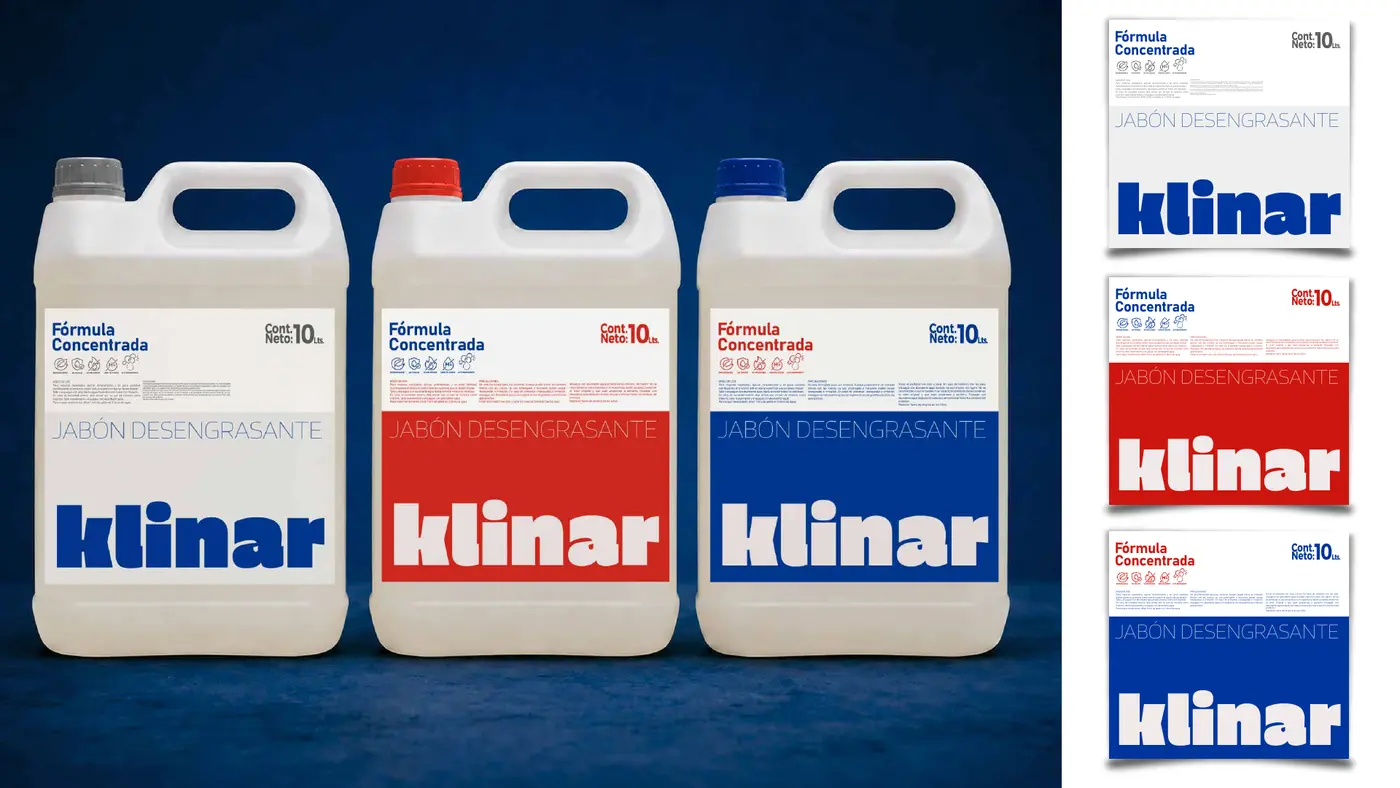
Klinar had a compelling value proposition, but one that was difficult to classify. We organised the information and used clarity to build a recognisable system that could work across different applications.
[ 01 · THE CHALLENGE ]
Explain, not merely attract attention.
Klinar needed to make the product, its uses and its difference easy to understand across household, commercial and industrial applications.
attributes, uses, instructions and precautions.
household, commercial and industrial without fragmenting the brand.
[ 02 · REFERENCES ]
The visual territory referenced by the client.
Intense colours, bold typography and power claims made the category recognisable, but could also make Klinar look like every other brand.
Familiarity helps a brand fit the category. It is not enough to make it distinctive.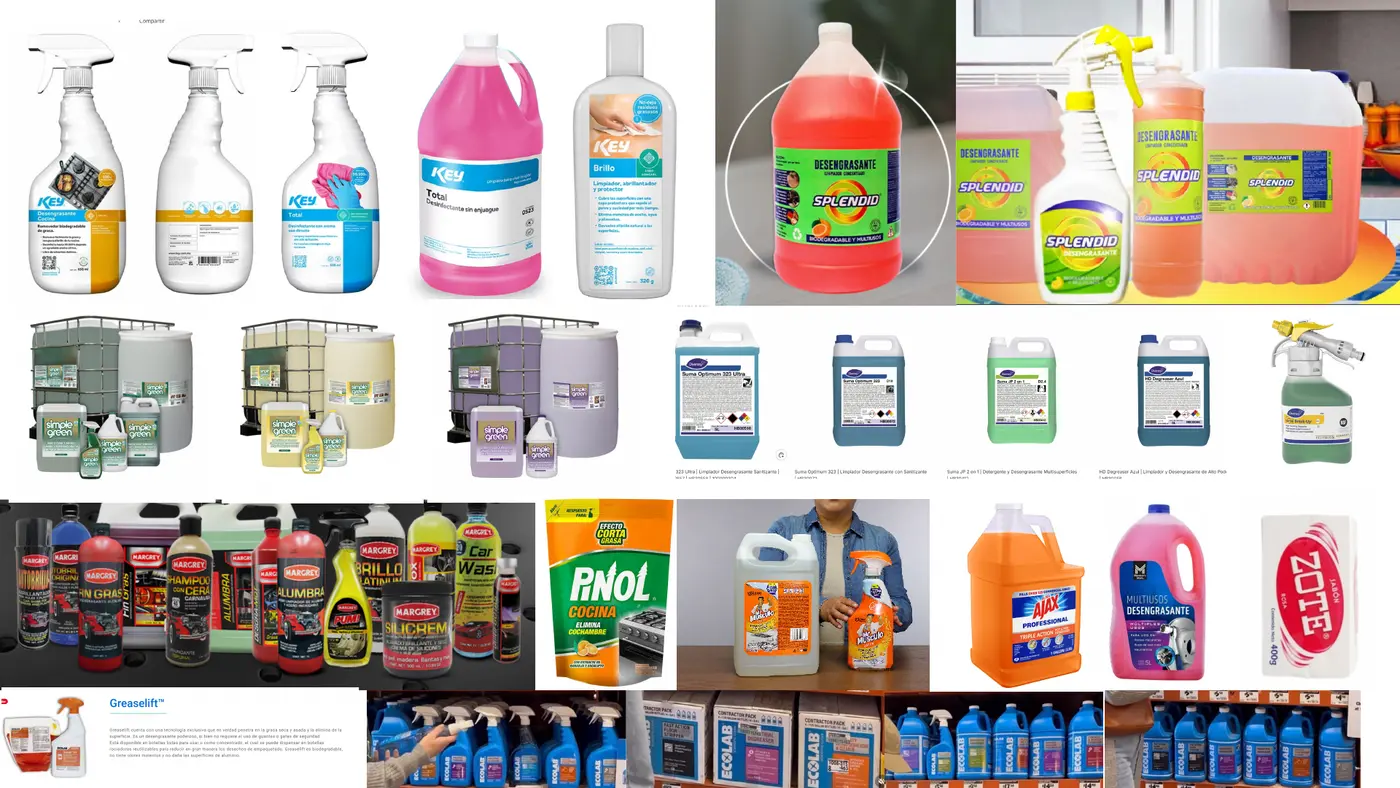
[ 03 · THE DECISION ]
Two possible directions.
The decision was not to erase every category code, but to retain only those that helped people understand the product.
Align with category conventions
Use familiar category codes to communicate effectiveness and support immediate recognition.
Build distinctiveness
Create a distinctive territory that expresses effectiveness through precision, clarity and technical control.
The references showed how brands signal the category. Our proposal explored how Klinar could stand apart within it.
Discover what your brand needs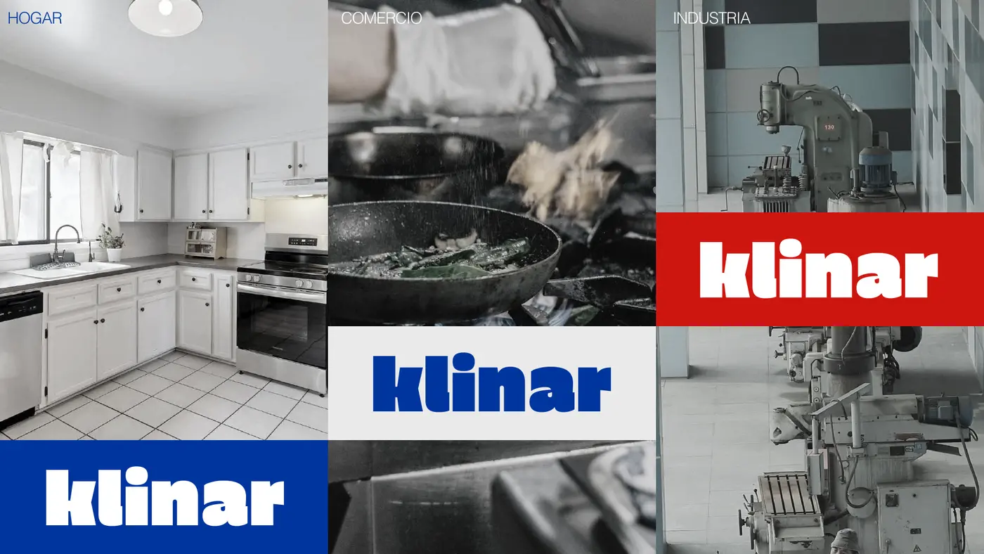
[ 04 · IDENTITY ]
An identity built around precision.
If the product’s difference lay in its formulation, the visual identity also needed to communicate expertise, precision and control. Clarity therefore became more than an aesthetic choice: it became a tool for differentiation.
[ 05 · SYSTEM ]
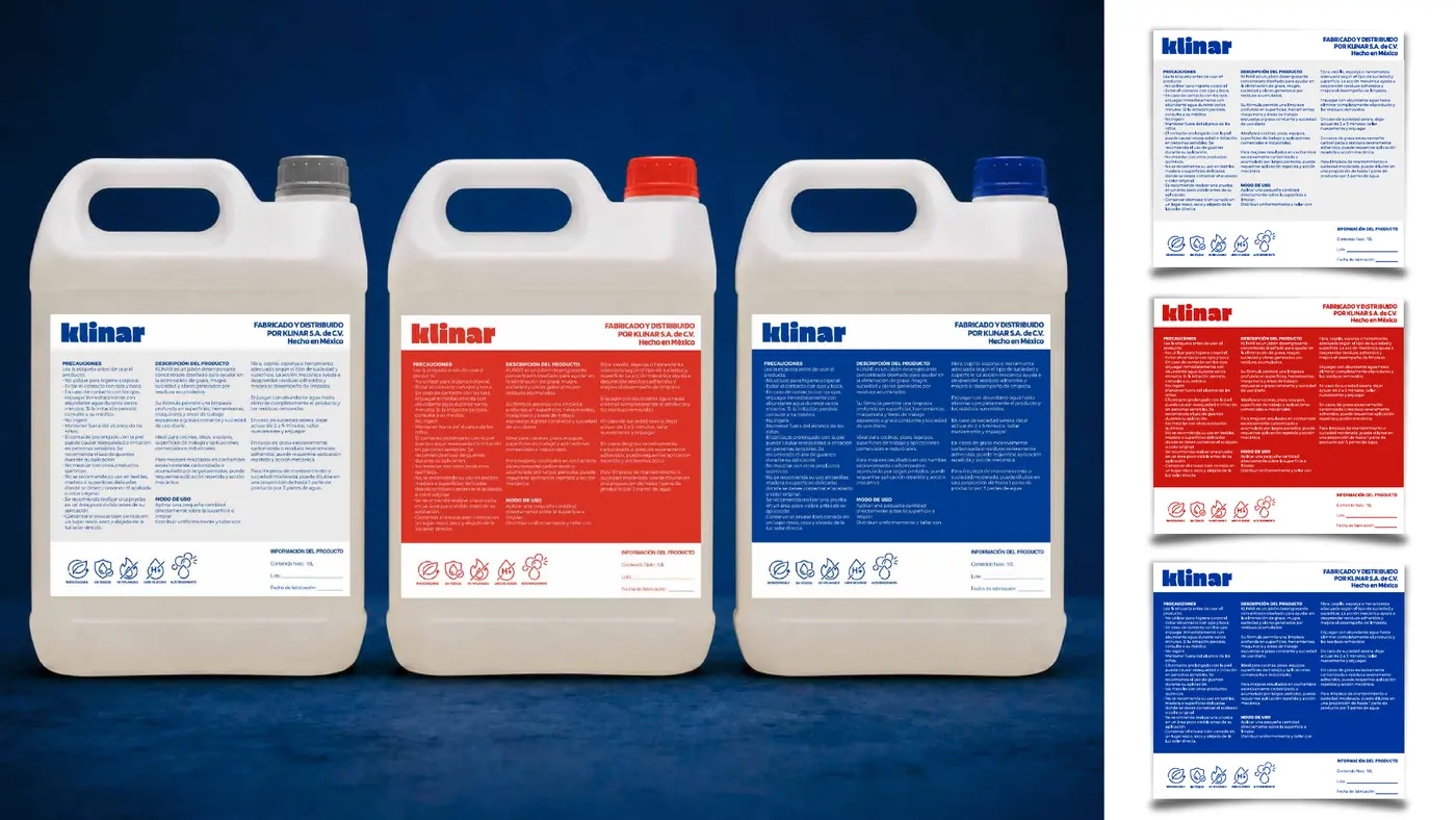
A system designed to work, not just a single label.
The system needed to work across household, commercial and industrial applications without creating a different identity for each. Reducing the number of elements did not mean removing information, but establishing a clear hierarchy between brand, product, features and instructions for use.
[ 06 · TWO DIRECTIONS ]
Comparing directions made the strategic choice visible.
Differentiation proposal
Clarity as a tool for differentiation.
Developed from the brief, the declared technical attributes and the opportunity identified through exploratory analysis. A clean, precise visual language intended to strengthen perceived value and recognition.
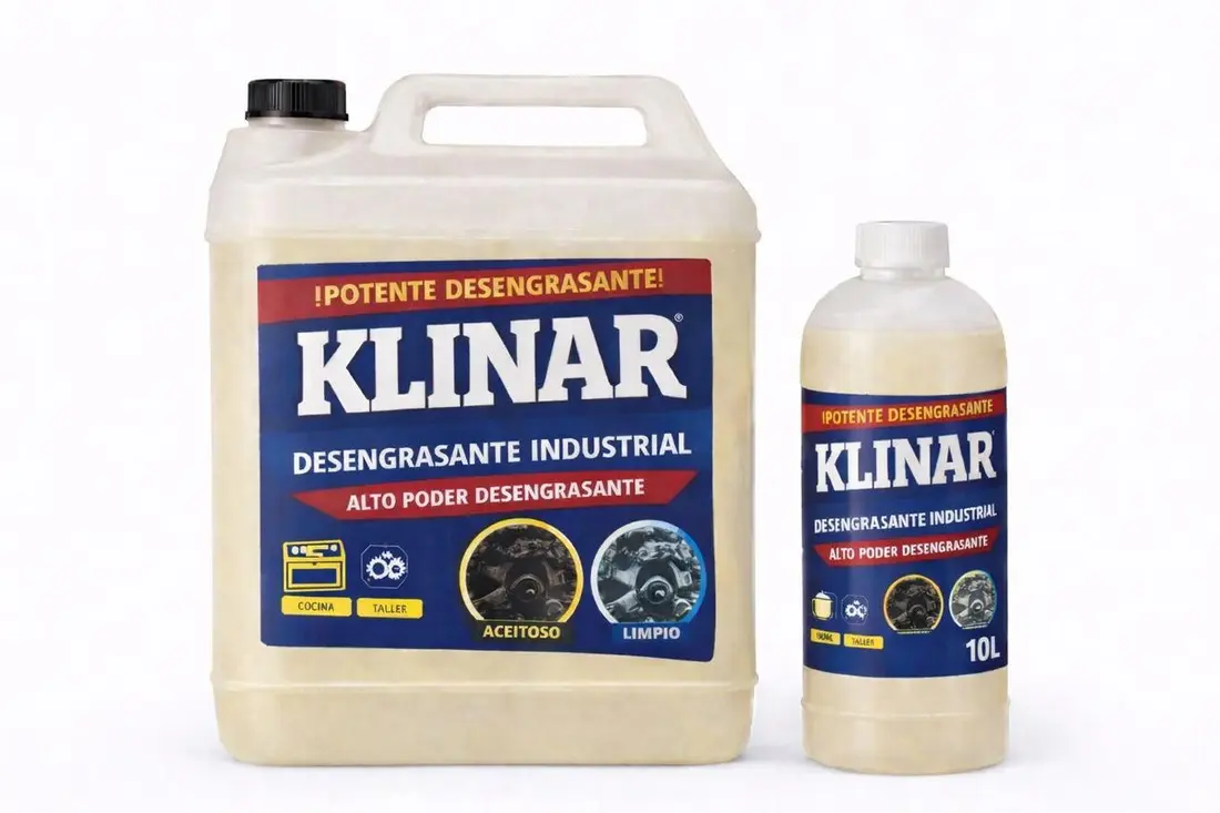
Direction supplied by the client
Reconstruction, organisation and production preparation.
This alternative began with a visual proposal supplied by Klinar. Our role was to rebuild the artwork professionally, improve its graphic quality, reorganise the information and prepare editable files for different packaging formats.
[ OUTCOME ]
A system designed to work beyond the presentation.
Klinar now has a coherent system for developing new variants, adapting to different formats and communicating the product more clearly.
- Status
- Identity and packaging system developed
- Verifiable scope
- Hierarchy, variants and applicable files
- Decision
- Differentiate through clarity and precision